aller Developments in the production of all kinds of publications increase in speed and impact. Many publication designers (books, newspapers, magazines, corporate identities) and their customers are not aware of these changes. Even designers for new media, such as blogs, websites, apps and e-books tend to see their work as local and separate.
With a modest guess of an increase in speed of 2.5 times, the next 10 years are comparable with the change, 25 years ago, from photo-typesetting to desktop publishing. These changes will continue, offering less time for users, customers, designers and producers to adapt their knowledge, experience and behavior. As designers, we must be aware of these changes to make our work needed in the future.
Where by definition it is impossible to predict discontinued developments, it is feasible to envision technology driven developments by extrapolating what has happened in the past years. Xierpa addresses these issues from the perspective of the future of design and the increasing wide range of platforms and devices.
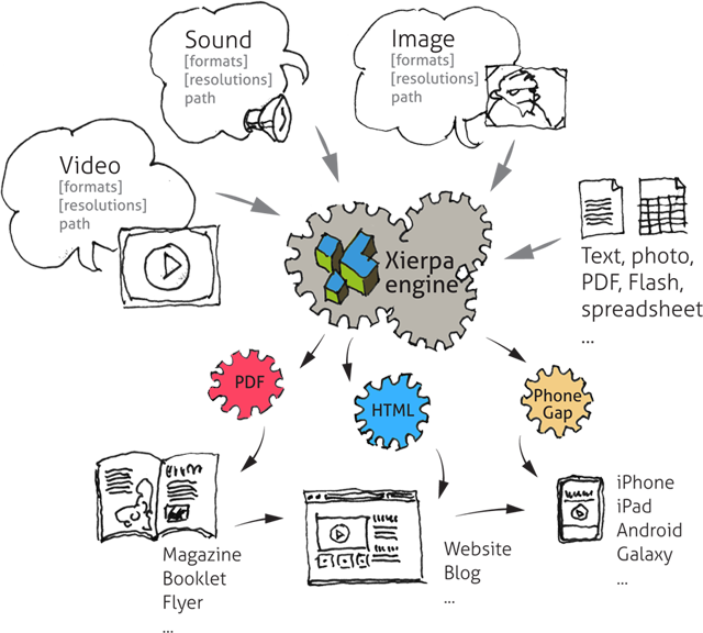
Xierpa offers a setup where the output, whether for print, computer or smartphones, is generated from the data storage according to the rules of the current design. Output specific changes of the content are saved as additions to the original data, so these don’t have to be recovered from the output files. The output is based on design parameters, that can change manually or automatic when the output conditions changes.
With Xierpa it is possible to construct a web application or a web site that adapts to the the individual user and output conditions.
Digital magazines
Online design application
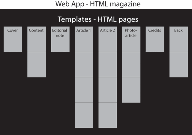
Design templates
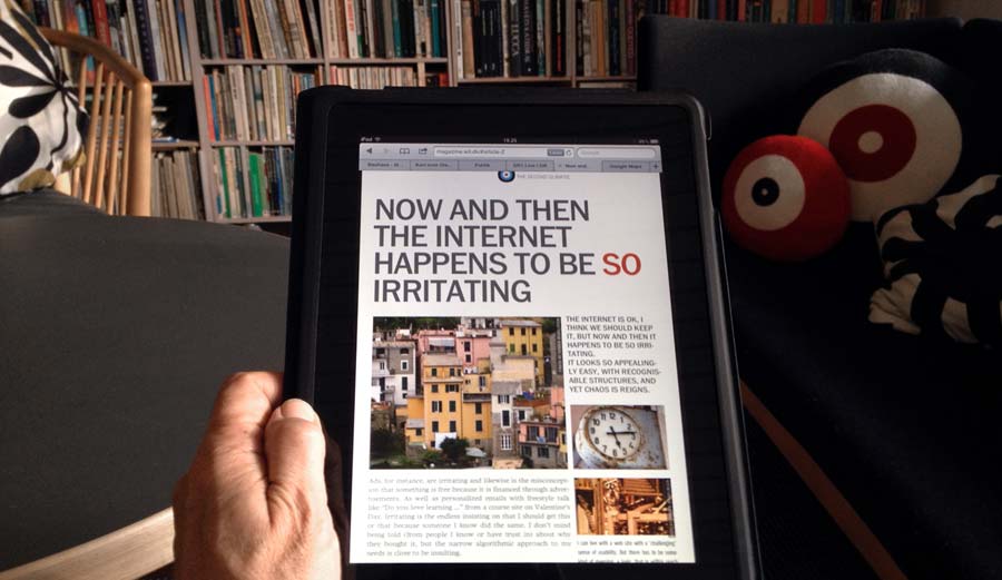
The magazine is a html5 browser based application that runs equaly on computer, tablets and smartphones, as well as it will presumably on most devices we can think of in the ‘near’ future if it has a web browser. It’s a single html-javascript-css application that acts as the container for the articles, each of which is a adaptive designed html page that both inherit style and javascript from the parent application and can have it’s own setup.
The magazine is closely integrated with web site CMS.
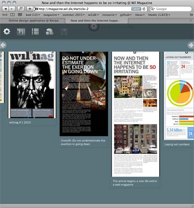
The magazine has a waterfall overview of the content
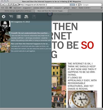
The magazine also have a ‘simple’ content view.
The magazine layout is build on a 4-columns grid for the maximum scren size, that reorder to fewer columns on smaller screens
From 2010 to 2012 Nomad Editions (N.Y. based publisher) was publishing their weekly web based magazines that ran the same way on computer, mobiles, ipad and so on – all from the same files.
The actual magazine viewing was based on the javascript library Treesaver. But beneath this ran the publishing environment XierpaLib, that worked both as an editorial CMS and a rendering machine for images, xml/html, and other resources, that Treesaver needed.
By means of xierpa.com was developed a new desktop style version, that was implemented in january 2011.
Note: Nomad Editions closed early 2013 due to missing subscribers and funding.
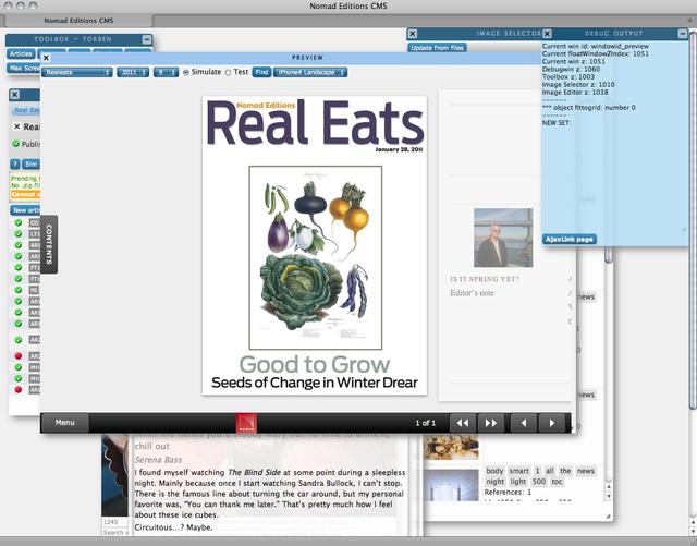
All tasks, from selecting tools to preview the magazine, are placed in floating windows, that may be collapsed, open/closed or moved around, and thus let an editor with a big screen take advantage of that. Or let the small screen people work with their open tasks in layers.
The Xierpa engine outputs all the files and imagesizes needed for the magazines.
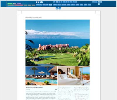
The catalogue is published in more than 25 languages, in portrait and landscape format. The Xierpa CMS handles the design templates, texts, images and the editing of the content by many editor’s in the same time. When the editions are ready, Xierpa generates PDFs for all of them.
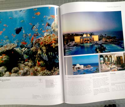
A spread from the english portrait format catalogue
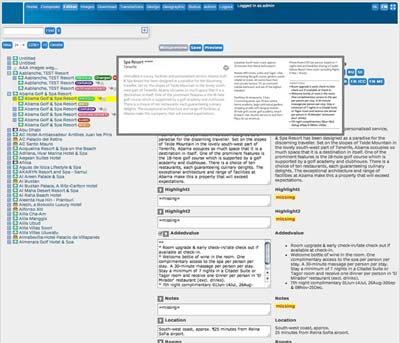
The multi-language content editor
Online preview of the page in the catalogue.
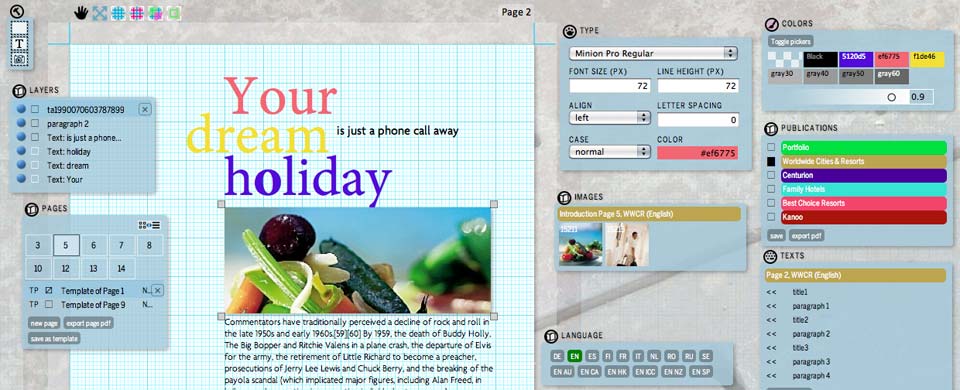
Where the most online design are built into more or less strict design templates, the editor offers an interface more like the way designers normally work with the layout.
Designers interactively move their objects, text and images, around to fit the grid. The CMS takes decisions based on the built-in design rules in relation to the type of magazine at hand, to correct and store the design.
It depends on the server program if the layout is defined for only one page (including different sizes for responsive layouts) or if the layout is defined as generic template that can be filled automatically with content from the database.
➜ Work-in-progresss demo of the editor
The editor is bridging the layout and the CMS.
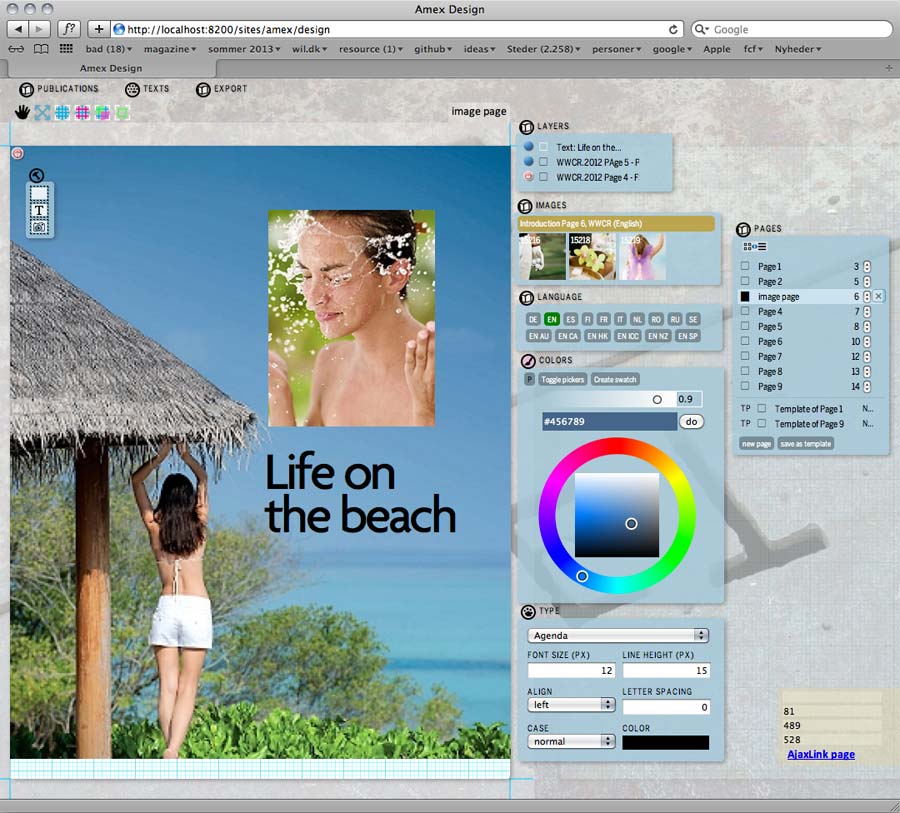
This is a screen shot from the working prototype of the layout editor. Notice the draggable windows with functions and features, comparable to the existing windows in the current CMS.
The editor supports dragging of text and images, dragging of layer order, color selection, page order, grids, typographic parameters, WYSIWYG text, etc.
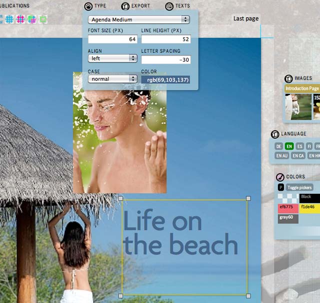
The text can be edited and styled in a simple text field or a WYSIWYG editor
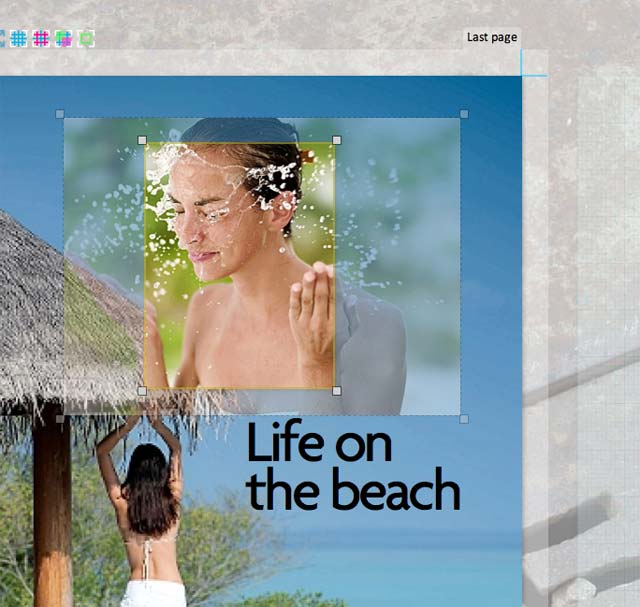
Images can be scaled and cropped in a live interface.
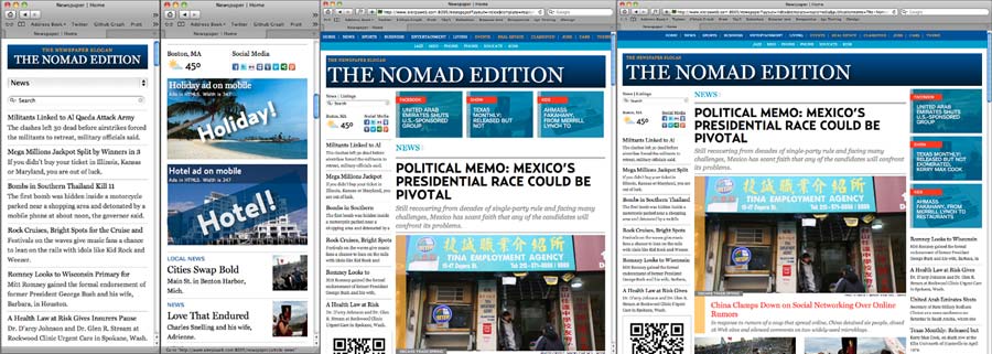
Examples of newspaper templates rendered on different devices or screen sizes: Smartphone has a linear layout. In a 2-column iPad-portrait size, components are distributed on the page, to remove the right column. With desktop or iPad-landscape size, there is enough room for two side columns.
Xierpa includes a high-level functionality for responsive magazine and newspaper production, and is being extended to be able to generate responsive templates for newspapers and magazines. The output can be directed towards different types of CMS systems, yet they are all generated from the same source code base. Parameters on the conversion input make different design style possible as can be seen in the examples.
The styling is all HTML and CSS standards, and given some basic tools and instructions, the development of new templates can be done by designers and programmers that understand these standards. This also counts for the adaptive repositioning of page elements at different page sizes.
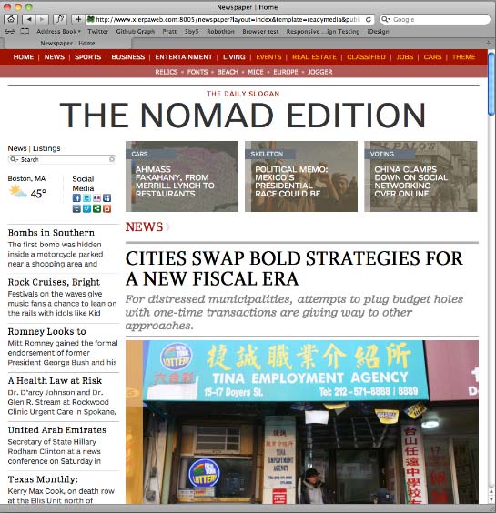
By changing some parameters, a new CSS is generated, with a different layout. In principle all variations of designs can be defined on a higher level of abstraction, which makes the creation of new templates for different publications much faster and reliable.

Ads are built into the design as responsive and adaptive blocks.
These are 3 sizes of 2 example ads, with responsive HTML/CSS layout, using web-fonts. The images change as result of the width change of the ad. The ads come from a different server than the page and have their own individual sizing rules and CSS. Note the displayed pixel size for debugging.